I recently have been writing a decent amount of CSS and
one of the things I have really enjoyed is the new
grid layout
and specially the grid gap
property that let’s you set the distance, sometimes
called gutter,
between the grid cells which is actually a supper common thing to do.
IMPORTANT the
gapproperty only modifies the distance between cell items, and it does not affect the distance of those cell items to the edges of the grid container.
It turns out that the gap property can also be used with
flex layout
and it solves so many problems!
But there are still some browsers that don’t support the gap property while
using the flex layout among which you can find safari,
see compatibility table,
so below there is a really easy method to simulate the gap between flex box items.
With flex gap#
.container {
  display: flex;
  flex-direction: row;
  flex-wrap: wrap;
  /* the magic property */
  gap: 10px;

  /* demo only properties omitted */
}

.item-a {
  flex: 1;

  /* demo only properties omitted */
}
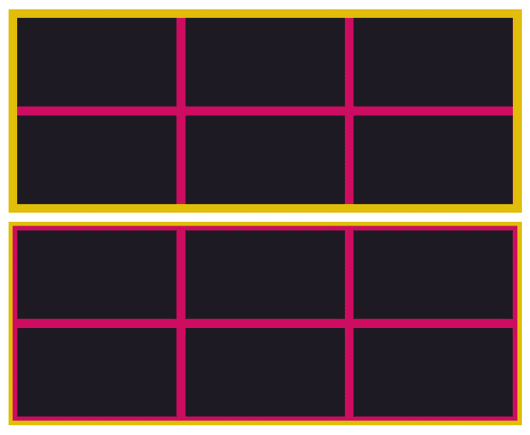
You get something like this:
- yellow: a trivial wrapper, not involved in the actual layout.
- pink: the flex container, it only shows through the
gaps. - black: the flex items.
Without flex gap#
We can easily simulate the gap property with a slightly
more complicated method of giving each item half of the
size of gap via margin and offsetting the container by
giving it a negative margin of that same amount.
This is because the gap property only affects the distance
between items and it does not affect the distance between items and
the edges of the flex container.
.container {
  display: flex;
  flex-direction: row;
  flex-wrap: wrap;
  /* gap replacement, part 1 */
  margin: -5px;

  /* demo only properties omitted */
}

.item-b {
  flex: 1;
  /* gap replacement, part 2 */
  margin: 5px;

  /* demo only properties omitted */
}
As you can see, the flex container will eat up some space of its
parent, the wrapper, which is going to be most of the time necessary
to render things as you would expect with gap.
Comparing#
The end result is about the same, but you might need to wrap it up in another container for more flexible composition.
Closing#
Check the example code, let me know if you have any questions.


