I consider PR reviews as one of the fundamental and most important tools developers have to collaborate. We use it daily to submit changes and to get important feedback from peers and more experienced developers.
And so, it should be targeted to software developers and not to managers.
Let’s cover some of the daily tortures of dealing with Bitbucket, which I unfortunately need to deal with.
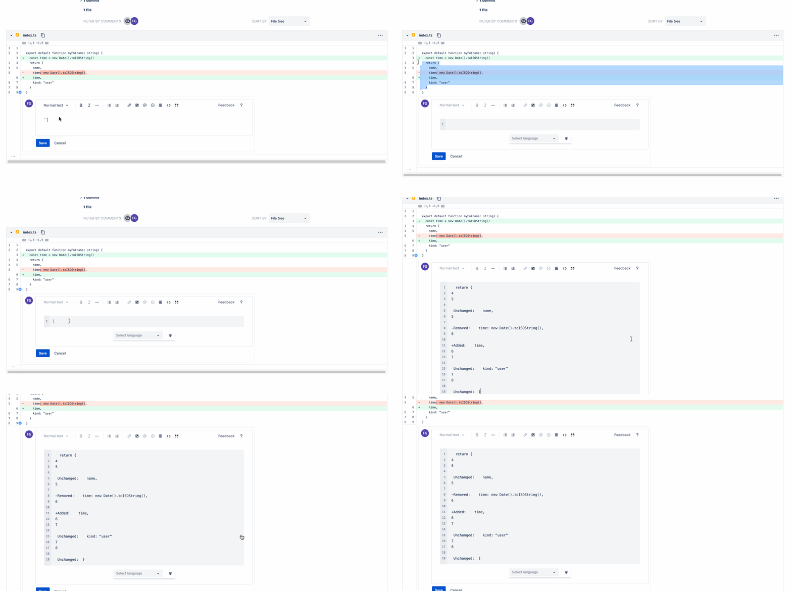
Copying code from the PR changes into a comment#
Hey friend, how about you implement this piece of functionality in this other way?
This common and healthy workflow is fundamentally broken in BB because you cannot copy code from the body of the PR into a comment without getting a lot more than what you clearly selected.

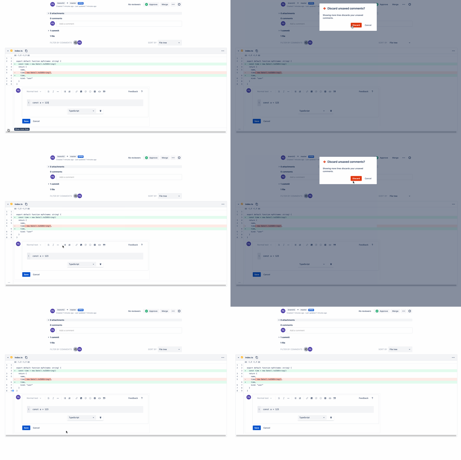
Are you sure you want to discard (actually not) your comments?#
Trying to click anywhere else when writing a comment like for example expanding to see more code will result in an alert that states that your comment changes will be removed which is already super annoying. But if you even do not care about discarding your comment and you go ahead and click on discard the comment isn’t really discarded! So it is completely misleading.
This is BB not caring about the amount of time developers throw into detailed code reviews.

What You See May Be What You Get: horrible markdown support#
Markdown is a tool aimed for technical folks, it is minimal but gets the job done without any distractions, it is not WYSIWYG (what you see is what you get) by design and partially for simplicity.
BB takes the worse of all worlds: horrible “standard” markdown support that varies across places and combine it with a WYSIWYG editor. This creates really weird use cases we will cover below.
Other technical tools, such as Github, understand how important decent markdown support is and they use it to empower developers. They do build visual tools on top of markdown but without combining them into a monster broken implementation.
Let’s see some specially frustrating cases
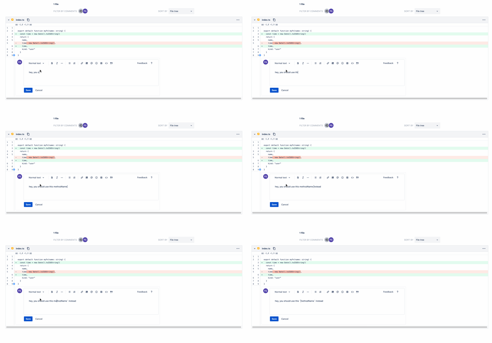
Selecting a code block language#
Instead of using the standard ”```typescript” they include a visual Select. Guess what, professional developers don’t need this help at all, and newbies can search the web once and forget about this.
Think about ergonomics, with regular markdown you do everything with the keyboard, with the BB inferno you first need to type the three backward ticks and then grab the mouse and select your language and then click back on the code block.
This is a really poor understanding of your user’s UX!

Smart (dumb) markdown hybrid support#
The WYSIWYG markdown hybrid implementation produces stuff like this

List items without an empty line#
This cannot happen in the comment textbox unless you force it to, but it can happen in the PR description textbox and it can also happen when you write the markdown in a regular text editor / IDE i.e. when committing code via git, when writing the README, etc.
If you don’t leave an empty line before a list then it won’t get transformed correctly:

Performance of the text box#
I have a pretty good and modern computer but most of the time I experience heavy lags when writing a simple text only comment in BB.
I suspect this is related to the horrible WYSIWYG implementation, which we have just heavily broken down above.
Doesn’t work on large PRs#
When a PR is a large (I know, I know, large PRs should not happen, but unfortunately sometimes they do) BB will choose either
- consuming a lot of resources
- not displaying the entire PR
In either case the UX ends up being bad.
In case 1. you will get a lot of RAM being consumed and most likely the scrolling and the interaction with the page will be even more slow and awkward.
In case 2. you need to click file by file to inspect a PR, which isn’t better IMO.
Bitbucket is Jira applied to git#
I’ve seen that the described behaviors tend to be cross cutting problems across the Atlassian suite, Jira has similar problems and Confluence is horrible, they are generally really slow and clunky and unresponsive and text editing tends to be a pain.
Understanding your product#
PRs are one of the core use cases of BB as a product, they are what have arguably made Github the beacon that it is now.
There are a few things your PR experience needs to provide at the base level
- PR title, description and inline comments.
- Every text box needs to support plain markdown and maybe mentioning other people (tagging).
- If you want to add markdown shortcuts make them insert markdown and not actually applying style.
- Good diffing visualization (which BB does well IMO).
- It is all about the code!
- Copying code from the diff needs to work as expected.
- Markdown code blocks (code snippets) are a fundamental feature of all your text boxes.
- Either provide a really good experience inside your code blocks or do nothing.
- Your app needs to be simple, small, fast and stable in time.
- Some PRs are open for long periods of time, make sure your app is stable!.
These are one the core features a good PR UI needs to provide, if anything, these need to be the best of the best.
BB seems to have prioritized being “cute” or “pretty” (is it?) instead of being functional.
Solutions#
Bitbucket is a developer centric platform, use developer centric tools, use plain old text inputs with good markdown support, add as little as possible on top of that, make the experience of writing comments, PR descriptions, code snippets as easy, simple and fast as possible.
Don’t leak stuff from Jira and Confluence to Bitbucket, they have different audience.
And if you have time… make sure every text input in your system has a plain text mode, where either you interpret it as good old markdown or as unformatted text, either is much better than what you have now.
Closing#
Liked the content? Consider subscribing, buying me coffee or even becoming a Patreon below.
